|
|
Post by Erathor Pridenar on Mar 9, 2014 21:52:36 GMT -8
|
|
Schmidt
Adventurer
Lord of the Bargain
All for one, one for all, every man for himself!
Posts: 1,330 
|
Post by Schmidt on Mar 10, 2014 10:20:13 GMT -8
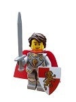
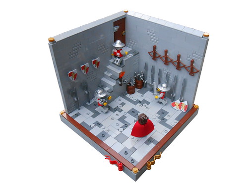
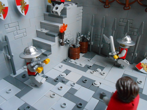
Hey Ieuan. I agree, I think this is your best work yet, and far better than anything I have built! I love the greebled floor with the bley colors. I think your color scheme is spot on. Your fig posing's are great and give a sense of livelihood to the MOC! I have two personal critiques. 1.) I think the steps are a tad too high. Given the posability of a minifigure, I personally feel a three plate step is too high for their stubby legs to realistically climb. The fellow on the top step is almost even to the step at his waist. Then again, this would prove for some nice exercise  Perhaps a one or even two plate difference in each step would look slightly more realistic. 2.)The crossbows and shields seem to be awfully high. I don't know that our Loreesi Heroes would be able to reach them without the aid of a ladder! Then again, these are rather small things to note. This is a really nice MOC that you have edited well. These soldiers look ready to bring some beatdown upon the dragon knights  |
|
David
Minstrel
Working on Site Details and gathering resources.
Posts: 113
|
Post by David on Mar 10, 2014 12:30:50 GMT -8
I think this is a great build and if I were doing something similar I would try to add some dept to the walls. Like you mentioned maybe some arched at the top with a portion of the wall inset to add depth. Think about how curtains add depth in a room. Also color really is important to me. Maybe some dark bley brickbricks added to to the lighter ones. Another thing that would really pop would be wood racks along the walls to hold the weapons. I think that would look fantastic. Also please take this with a grain of salt as I don't claim to be an expert, but for my personal taste, I like symmetry with flooring. If you think of it as stone work, then they probably would have used the same size stones for the floor and you can deviate from the pattern by using different colors (like you are doing) and even have a tile missing with maybe some brown underneath to imply decay and exposed dirt. I recently did a build similar to this and you can see some of the examples I am talking about. 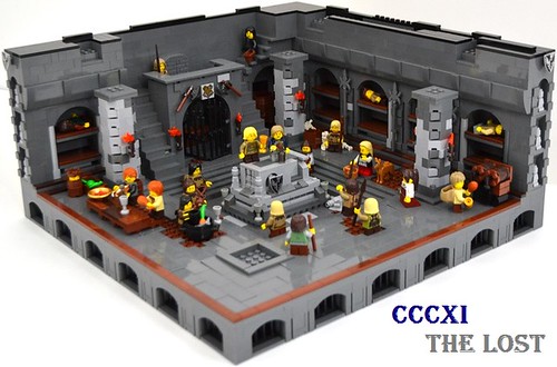 |
|
Rifiröfi
Outlaws
Wolfgang has gone into hibernation indefinitely...
Posts: 78
|
Post by Rifiröfi on Mar 10, 2014 14:07:44 GMT -8
Hi Ieuan,
this is a solid vignette, my remarks:
- loved how you used those double cheese slopes on the top of the walls
- the posing is good, but it is a pity that we only see the back of your character, you could have turned him and moved a bit to the right (diagonally)
- What is the soldier is doing with that spear and sword? Looks like he is trying to cut the spear's head off? Or tries to sharpen it?
- The shields and crossbows are way too high unless they are used to decorate the room.
- You could have placed more barrels and crates, the rooms is kinda empty.
- Maybe some arches on the right wall could have been a great addition, but it is hard to tell.
Despite the points above I really liked your MOC.
Cheers
Adam
|
|
|
|
Post by Erathor Pridenar on Mar 10, 2014 21:55:49 GMT -8
Hey Ieuan. I agree, I think this is your best work yet, and far better than anything I have built! I love the greebled floor with the bley colors. I think your color scheme is spot on. Your fig posing's are great and give a sense of livelihood to the MOC! I have two personal critiques. 1.) I think the steps are a tad too high. Given the posability of a minifigure, I personally feel a three plate step is too high for their stubby legs to realistically climb. The fellow on the top step is almost even to the step at his waist. Then again, this would prove for some nice exercise Perhaps a one or even two plate difference in each step would look slightly more realistic. 2.)The crossbows and shields seem to be awfully high. I don't know that our Loreesi Heroes would be able to reach them without the aid of a ladder! Then again, these are rather small things to note. This is a really nice MOC that you have edited well. These soldiers look ready to bring some beatdown upon the dragon knights Thanks very much SSchmidt! I would not say that it's better then yours, though; I very much look up to you as a builder! 1.) Very good point, I hadn't thought about that! I think one plate would be fine actually, so I'll remember that next time! 2.) Lol, I've heard this before! I felt that the walls needed something there to make them look better and less empty, but I could have included arches, or something similar, instead.  Yep, that's what they're gonna do, and Silas better be ready! Thanks again mate! |
|
|
|
Post by Erathor Pridenar on Mar 10, 2014 22:01:30 GMT -8
I think this is a great build and if I were doing something similar I would try to add some dept to the walls. Like you mentioned maybe some arched at the top with a portion of the wall inset to add depth. Think about how curtains add depth in a room. Also color really is important to me. Maybe some dark bley brickbricks added to to the lighter ones. Another thing that would really pop would be wood racks along the walls to hold the weapons. I think that would look fantastic. Also please take this with a grain of salt as I don't claim to be an expert, but for my personal taste, I like symmetry with flooring. If you think of it as stone work, then they probably would have used the same size stones for the floor and you can deviate from the pattern by using different colors (like you are doing) and even have a tile missing with maybe some brown underneath to imply decay and exposed dirt. I recently did a build similar to this and you can see some of the examples I am talking about. Thanks for the comment David! Wall depth is something I need to work on generally, as it makes a MOC so much more realistic. I was told the same ting when building rockwork: always make it go back further than one brick. As for wooden racks, I think they're a great idea! I shall be experimenting with them, they may well be used in an upcoming build. Symmetry with flooring...it does work, but sometimes I feel that 'messy' stonework makes it look more realistic. Each to his own, I guess! I suppose that I can always add in a darker one here and there, to create a similar effect. I love that MOC so much! Thanks for the inspiration! |
|
|
|
Post by Erathor Pridenar on Mar 10, 2014 22:05:21 GMT -8
Hi Ieuan, this is a solid vignette, my remarks: - loved how you used those double cheese slopes on the top of the walls - the posing is good, but it is a pity that we only see the back of your character, you could have turned him and moved a bit to the right (diagonally) - What is the soldier is doing with that spear and sword? Looks like he is trying to cut the spear's head off? Or tries to sharpen it? - The shields and crossbows are way too high unless they are used to decorate the room. - You could have placed more barrels and crates, the rooms is kinda empty. - Maybe some arches on the right wall could have been a great addition, but it is hard to tell. Despite the points above I really liked your MOC. Cheers Adam Thank you very much Adam, especially coming from the master of small builds! -Thanks! I really like the effect they give. -People should be able to see his face, so I'll do that next time! -LOL! I don't know, maybe his hand slipped?!  -Yeah, they are, I know that by now! -Nice idea, more barrels would show that lots more weapons are expected to be arriving. -My thoughts exactly! Thanks once again man! |
|
David
Minstrel
Working on Site Details and gathering resources.
Posts: 113
|
Post by David on Mar 10, 2014 23:17:09 GMT -8
That is the beautiful thing about Lego; everyone has their individual style and taste and there is really no right answer, its all about what appeals to you |
|
|
|
Post by Erathor Pridenar on Mar 11, 2014 11:20:59 GMT -8
That is the beautiful thing about Lego; everyone has their individual style and taste and there is really no right answer, its all about what appeals to you I definitely agree, that's a huge reason why I keep building. I can change old ways, develop new techniques and be inspired by other people, all at the same time. |
|
|
|
Post by ladyalice on Mar 12, 2014 22:14:16 GMT -8
Nicely done!
I see you have a torch on the stairs, but what about some torches on stands? This could be something along the front part of the plate to bring your eyes to the front and not just along the back walls. If you did it in black, it also might make some color contrast. You could also consider them lining the wall as you go up the stairs and this might create an interesting parallel line with the stairs.
If you totally wanted to go crazy, you could experiment with some of the impressively tiny new lights from Brick Stuff. They even have the ability to make the light flicker- how cool would that be!
And since your walls are high, you might consider adding in a tiny window on one or both sides. This would break up the space a bit and maybe offer a chance for some interesting details in the window muntins or frame.
Keep on building!
Alice
|
|
|
|
Post by Erathor Pridenar on Mar 13, 2014 8:50:56 GMT -8
Nicely done! I see you have a torch on the stairs, but what about some torches on stands? This could be something along the front part of the plate to bring your eyes to the front and not just along the back walls. If you did it in black, it also might make some color contrast. You could also consider them lining the wall as you go up the stairs and this might create an interesting parallel line with the stairs. If you totally wanted to go crazy, you could experiment with some of the impressively tiny new lights from Brick Stuff. They even have the ability to make the light flicker- how cool would that be! And since your walls are high, you might consider adding in a tiny window on one or both sides. This would break up the space a bit and maybe offer a chance for some interesting details in the window muntins or frame. Keep on building! Alice Thanks a ton Alice! That's a great idea! I had a tall black torch in the build previous to this, so I could've continued the theme throughout. I would, if I had any! This is actually meant to be just below ground, so there wouldn't be windows, but I definitely needed something on the walls! Thanks once again! |
|
GyustSil
Lenfald
Overseeing works at Oakenfort, for the Great Lenfald!
Posts: 212
|
Post by GyustSil on Mar 18, 2014 8:40:07 GMT -8
That's a nice build! I'm not sure it's your best, for you've done lots of great MOCs, but this one is definetely very good!
In addition to the other comments, I would say that maybe if you changed the big slopes in the floor for smaller and/or round ones it would look more realistic. And I would also texture the wall a little bit more.
Except that, the MOC is really great!
Hope you keep on building great MOCs!
Gyust
|
|
|
|
Post by Erathor Pridenar on Mar 18, 2014 9:08:48 GMT -8
That's a nice build! I'm not sure it's your best, for you've done lots of great MOCs, but this one is definetely very good!
In addition to the other comments, I would say that maybe if you changed the big slopes in the floor for smaller and/or round ones it would look more realistic. And I would also texture the wall a little bit more.
Except that, the MOC is really great!
Hope you keep on building great MOCs!
Gyust Thanks Gyust! I need to work on my floor tile variation, so I'll add in more round ones next time. |
|
mpoh98
Brawl Masters
Brawl Master
Lord of the Oakleaf Order, Creator and Lord of The Order of Aithellon
Posts: 241
|
Post by mpoh98 on Mar 18, 2014 10:18:02 GMT -8
Very nice job, I think it is a great build! I agree with Fraslund/David, the walls are a little bare, if you added more detail it would look better. Great work!
|
|
|
|
Post by Erathor Pridenar on Mar 18, 2014 21:58:41 GMT -8
Very nice job, I think it is a great build! I agree with Fraslund/David, the walls are a little bare, if you added more detail it would look better. Great work! Cheers Matt, I'll be sure to do that in the future! |
|