AK_Brickster
Innkeeper
Scouting the Lenfel Border
Posts: 3,272 
|
Post by AK_Brickster on Apr 18, 2017 7:55:26 GMT -8
Hey M-Beardites!
I thought it would be cool to start up a thread that has been popular on other sites / forums - Reviewing each other's MOC's and asking for constructive critiques on your own!
Rules/Format:
Someone will kick things off by posting a MOC that they'd like someone to review / comment on / critique, for the purpose of feedback and improving your building and photography skills (keep it limited to 3 photos, please - offsite link is OK so reviewer can zoom in, if desired).
The next person will then provide a review of that MOC here in this thread, keeping the feedback constructive and helpful. Feedback can range from comments on techniquest that might be used to improve certain sections, part suggestions, or photography/lighting tips.
That person will then post their own MOC, and the pattern repeats itself indefinitely.
OK, so the first one is a freebie, as you don't have to critique anyone first. Who's it going to be?
|
|
Marley Mac
Serf
Writing my next short story...
Posts: 15
|
Post by Marley Mac on Apr 18, 2017 16:07:12 GMT -8
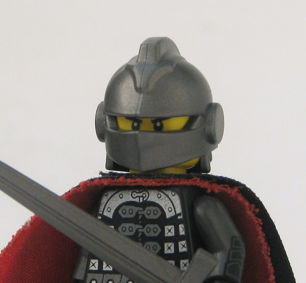
"Who's it going to be?" Me! I was wondering if anyone would like to give any critiques on this WIP photo for a contest over on Mocpages. 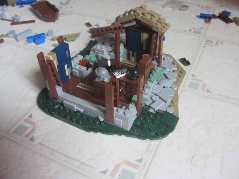 LCBTC: WIP LCBTC: WIP by Marley Mac, on Flickr And this: 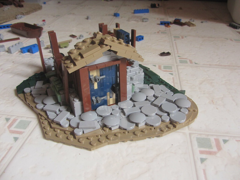 LCBTC: WIP LCBTC: WIP by Marley Mac, on Flickr |
|
josdu
Outlaws
Marooned on the Island of Lost Souls
Posts: 1,176
|
Post by josdu on Jul 3, 2017 13:04:30 GMT -8
Since Marley already finished his build I guess I'll critique the final version; 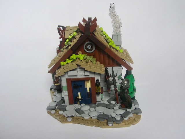 LCBTC-R1: The Phoenix's Feather LCBTC-R1: The Phoenix's Feather by Marley Mac, on Flickr Good work. I personally find that the path looks worse with two colours in it and wish you had kept it the other way, but the texture in it is nice. Another thing I think looks bad is the tan in the door, as I think it's just a weird choice. Better all blue, or maybe brown but not tan. Another last thing would be the colour of the leaves on top. Change it to normakll green I think and it would be cooler, since it would match the trees. Overall, my critique is mostly on the colours; the rest looks pretty great to me! Here's a build of mine someone could critique if they please;  #3. A Just Man (Les Miserables) #3. A Just Man (Les Miserables) by W. Navarre, on Flickr Thanks (and neat idea AK). |
|